clin <- read.table("Colas_clinical/clinical_data.txt", header = TRUE)
dim(clin) # 208 records and 9 variables
[1] 208 9As in any statistical data analysis in CGM research we have two datasets to merge by patient ID (id):
clin: clinical characteristics loaded from "Colas_clinical/clinical_data.txt" (one row per patient).
cgm: CGM data in long format loaded from "Colas_clinical/colas_long.csv" (many rows per patient).
The clinical data contains one record per patient with variables such as age, gender, BMI, fasting glycaemia, HbA1c, follow‑up time, and a final diagnosis of type 2 diabetes mellitus (T2DM). A categorical BMI version (BMI_cat) is also included.
We then compute several glycemic variability indices (e.g., MAGE and J‑index) using the iglu package on the long‑format CGM data. These functions return a data frame with one row per patient. Finally, we merge the clinical data with the MAGE results, and optionally with the J‑index results, to create a combined dataset for further analysis.
clin <- read.table("Colas_clinical/clinical_data.txt", header = TRUE)
dim(clin) # 208 records and 9 variables[1] 208 9The variables are:
names(clin)[1] "id" "gender" "age" "BMI" "glycaemia" "HbA1c"
[7] "follow.up" "T2DM" "BMI_cat" | Variable | Type | Description | Coding / Units |
|---|---|---|---|
id |
integer | Unique patient identifier | 1–208 |
gender |
integer | Sex of the patient | 0 = male, 1 = female |
age |
integer | Age in years | years, continuous |
BMI |
numeric | Body mass index | kg/m², continuous |
glycaemia |
integer | Fasting blood glucose concentration | mg/dL, continuous |
HbA1c |
numeric | Glycated hemoglobin | %, continuous |
follow.up |
integer | Number of days the patient was followed | days, continuous |
T2DM |
logical | Final diagnosis of type 2 diabetes mellitus | FALSE = no diabetes, TRUE = diabetes |
BMI_cat |
character | Categorical BMI (based on cut‑offs) | e.g., "[25,30)", "[30,48.7]" |
str(clin) # checking variable types'data.frame': 208 obs. of 9 variables:
$ id : int 1 2 3 4 5 6 7 8 9 10 ...
$ gender : int 1 0 0 0 1 1 1 1 1 1 ...
$ age : int 77 42 61 67 53 69 45 58 72 70 ...
$ BMI : num 25.4 30 33.8 26.7 25.8 31.6 42.5 25.5 35.6 33.3 ...
$ glycaemia: int 106 92 114 110 106 99 100 112 106 98 ...
$ HbA1c : num 6.3 5.8 5.5 6 5.2 5.7 5.5 5.9 6.2 5.5 ...
$ follow.up: int 413 1185 560 1183 918 968 249 1005 1179 1475 ...
$ T2DM : logi FALSE FALSE FALSE FALSE FALSE FALSE ...
$ BMI_cat : chr "[25,30)" "[30,48.7]" "[30,48.7]" "[25,30)" ...library(iglu)
cgm = read.csv("Colas_clinical/colas_long.csv", header=T)
mage = mage(cgm)
jindex = j_index(cgm)
mage# A tibble: 208 × 2
# Rowwise:
id MAGE
<int> <dbl>
1 1 56.8
2 2 50.9
3 3 34.5
4 4 55.3
5 5 50.4
6 6 47.9
7 7 49.1
8 8 66.8
9 9 35.2
10 10 36.5
# ℹ 198 more rowsdf = merge(clin, mage, by="id")
df = merge(df, jindex, by="id")
names(df) [1] "id" "gender" "age" "BMI" "glycaemia" "HbA1c"
[7] "follow.up" "T2DM" "BMI_cat" "MAGE" "J_index" head(df) id gender age BMI glycaemia HbA1c follow.up T2DM BMI_cat MAGE
1 1 1 77 25.4 106 6.3 413 FALSE [25,30) 56.81611
2 2 0 42 30.0 92 5.8 1185 FALSE [30,48.7] 50.92708
3 3 0 61 33.8 114 5.5 560 FALSE [30,48.7] 34.46567
4 4 0 67 26.7 110 6.0 1183 FALSE [25,30) 55.34278
5 5 1 53 25.8 106 5.2 918 FALSE [25,30) 50.44306
6 6 1 69 31.6 99 5.7 968 FALSE [30,48.7] 47.90908
J_index
1 14.00559
2 16.74482
3 11.18050
4 13.17472
5 13.99011
6 17.10983After merging the clinical data with the glycemic variability indices, we can explore the distribution of each index individually. This univariate analysis provides insight into the central tendency, dispersion, and shape of the data, and helps identify potential outliers or the need for transformations.
We focus here on the J‑index and MAGE as examples, but the same approach applies to any other computed metric.
We compute basic statistics such as mean, median, standard deviation, interquartile range, and percentiles.
mean(df$MAGE) # arithmetic mean[1] 42.93726sd(df$MAGE) # standard deviation[1] 16.81566summary(df$MAGE) Min. 1st Qu. Median Mean 3rd Qu. Max.
15.25 29.90 40.64 42.94 51.49 112.35 Histograms, density plots, and boxplots help visualize the distribution.
hist(df$MAGE, freq = FALSE, ylim=c(0, 0.027))
lines(density(df$MAGE))
abline(v=c(40.64, 42.94), col=c("red","blue"))
legend("topright",legend=c("median","mean"),col=c("red","blue"),lty=1,lwd=2)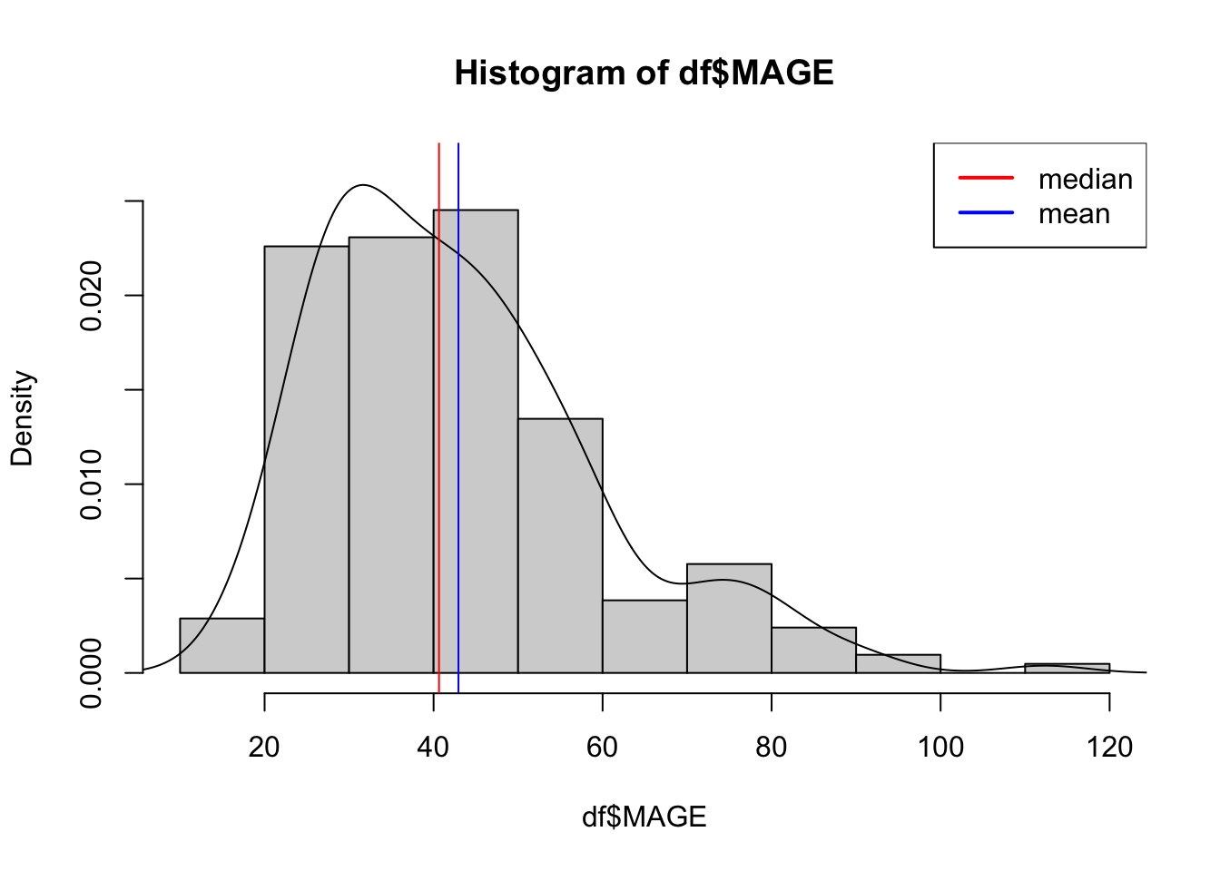
boxplot(df$MAGE, col = "navyblue", main = "Boxplot of MAGE", ylab = "MAGE values")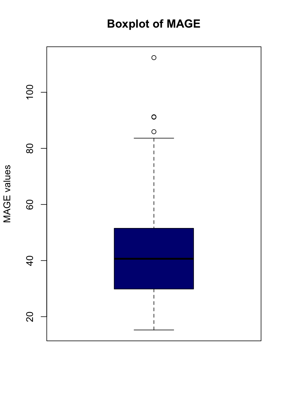
# Calculate "outliers" using boxplot.stats
outliers <- boxplot.stats(df$MAGE)$out
outliers
[1] 91.25733 112.35267 91.12857 85.94056mage[which(df$MAGE %in% outliers),] # who are they# A tibble: 4 × 2
# Rowwise:
id MAGE
<int> <dbl>
1 79 91.3
2 108 112.
3 109 91.1
4 180 85.9After characterizing each variable individually, we examine relationships between pairs of variables. Bivariate analysis helps uncover associations, potential confounders, and patterns that inform subsequent modeling.
We illustrate with the J‑index as a primary outcome, but the same approach applies to any index (e.g., MAGE, ADRR). We explore its relationship with both continuous and categorical clinical variables.
When one variable is categorical (e.g., T2DM or gender), we can compute group‑wise means and standard deviations.
tapply(df$MAGE, df$T2DM, mean) FALSE TRUE
42.14324 51.85827 tapply(df$MAGE, df$T2DM, sd) FALSE TRUE
16.60143 17.12803 tapply(df$MAGE, df$T2DM, summary)$`FALSE`
Min. 1st Qu. Median Mean 3rd Qu. Max.
15.25 29.29 39.82 42.14 49.61 112.35
$`TRUE`
Min. 1st Qu. Median Mean 3rd Qu. Max.
24.18 38.74 53.66 51.86 67.92 77.43 Graphs provide an intuitive understanding of bivariate relationships.
boxplot(MAGE ~ T2DM, data = df, col="orange")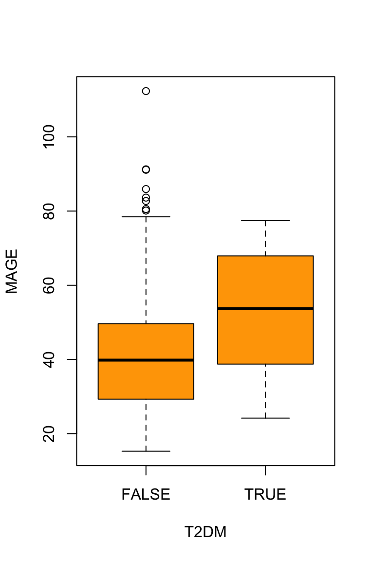
For pairs of continuous variables (e.g., J‑index vs. age, J‑index vs. HbA1c), we compute Pearson correlation coefficients and optionally non‑parametric alternatives. This quantifies the strength and direction of linear relationships.
# Correlation matrix for selected variables
vars <- c("age", "BMI", "HbA1c","J_index","MAGE")
cor(df[, vars], use = "complete.obs")
age BMI HbA1c J_index MAGE
age 1.0000000 -0.157674551 0.20115959 0.12656188 0.221780742
BMI -0.1576746 1.000000000 0.04029609 0.09526857 -0.001441941
HbA1c 0.2011596 0.040296089 1.00000000 0.28080972 0.195888159
J_index 0.1265619 0.095268572 0.28080972 1.00000000 0.723882804
MAGE 0.2217807 -0.001441941 0.19588816 0.72388280 1.000000000# Pairwise scatter plots
pairs(df[, vars], main = "Scatter plot matrix")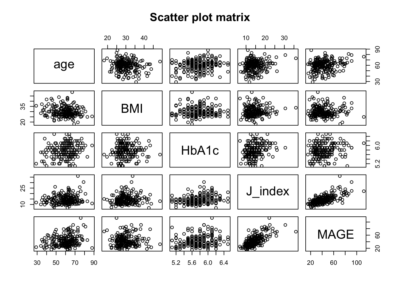
Any reader can freely check that there is not a single glycemic variability index following a Gaussian distribution in this data. Harder to believe or not, this is a common situation in practice (no need to panic, we have plenty of useful and efficient alternatives).
Before applying parametric tests such as t‑tests or ANOVA, it is essential to verify whether the data meet the normality assumption. For each continuous variable of interest (e.g., J‑index, MAGE, ADRR), we can examine:
Histograms and density plots for visual assessment of symmetry and bell‑shaped form [personally I fail to tell apart Gaussian and non-Gaussian based on histograms].
Q‑Q plots (quantile‑quantile) to compare observed quantiles against theoretical normal quantiles. Points that deviate systematically from the diagonal line suggest non‑normality.
Formal tests such as the Shapiro‑Wilk test (for smaller samples) or the Lilliefors test (Kolmogorov‑Smirnov with correction, suitable for larger samples). A small p‑value (e.g., < 0.05) indicates evidence against normality.
library(car)
qqPlot(df$MAGE)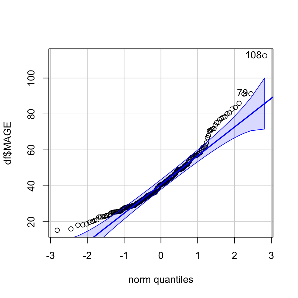
[1] 108 79shapiro.test(df$MAGE)
    Shapiro-Wilk normality test

data:  df$MAGE
W = 0.934, p-value = 4.361e-08
In our dataset, none of the glycemic variability indices appear normally distributed. This is a common finding in real‑world CGM data, where distributions are often skewed, have heavy tails, or show multiple modes. Fortunately, modern statistical practice offers robust alternatives:
Non‑parametric tests (Mann‑Whitney U, Kruskal‑Wallis) that do not rely on normality.
Transformation of variables (e.g., log, square root) to achieve approximate normality [I rather not].
The following sections will demonstrate these approaches, ensuring that our inferences remain valid even when the normality assumption is not met.
To compare glycemic variability indices between two independent groups (e.g., diabetes vs. non‑diabetes, male vs. female).
We observe no difference in MAGE values depending on patient sex:
tapply(df$MAGE, df$gender, mean) 0 1
43.74995 42.14004 wilcox.test(MAGE ~ gender, data = df)
    Wilcoxon rank sum test with continuity correction

data:  MAGE by gender
W = 5564, p-value = 0.7193
alternative hypothesis: true location shift is not equal to 0
We do observe differences in MAGE values depending on future type 2 diabetes incidence:
tapply(df$MAGE, df$T2DM, mean) FALSE TRUE
42.14324 51.85827 wilcox.test(MAGE ~ T2DM, data = df)
    Wilcoxon rank sum test with continuity correction

data:  MAGE by T2DM
W = 1072, p-value = 0.0205
alternative hypothesis: true location shift is not equal to 0When the comparison involves three or more independent groups (e.g., BMI categories, age tertiles, or glucose variability severity levels), the appropriate methods extend the two‑group framework.
tapply(df$J_index, df$BMI_cat, mean)[18.1,25) [25,30) [30,48.7]
13.14835 14.37074 14.96337 # Kruskal-Wallis test
kruskal.test(J_index ~ BMI_cat, data = df)
    Kruskal-Wallis rank sum test

data:  J_index by BMI_cat
Kruskal-Wallis chi-squared = 2.8559, df = 2, p-value = 0.2398
# Pairwise comparisons using Dunn's test (requires dunn.test package)
# install.packages("dunn.test")
library(dunn.test)
dunn.test(df$J_index, df$BMI_cat, method = "holm") Kruskal-Wallis rank sum test
data: x and group
Kruskal-Wallis chi-squared = 2.8559, df = 2, p-value = 0.24
Dunn's Pairwise Comparison of x by group
(Holm)
Col Mean-│
Row Mean │ [18.1,25 [25,30)
─────────┼──────────────────────
[25,30) │ -1.367018
│ 0.1716
│
[30,48.7 │ -1.688600 -0.568455
│ 0.1369 0.2849
FWER = 0.05
Reject Ho if p ≤ FWER/2 with stopping rule, where p = Pr(Z ≥ |z|)When many statistical tests are performed (e.g., comparing multiple glycemic indices across groups), the chance of observing a false positive by chance increases sharply. With 20 independent tests and α = 0.05, the probability of at least one false positive is about 64%.
Statistical tests, P values, confidence intervals, and power: a guide to misinterpretations
Greenland, S., Senn, S. J., Rothman, K. J., Carlin, J. B., Poole, C., Goodman, S. N., & Altman, D. G. (2016).
European Journal of Epidemiology, 31(4), 337–350.
A comprehensive guide to common misinterpretations of p‑values, confidence intervals, and power, with clear explanations and recommendations.
PMC free full text
The Hochberg Procedure for the Comparison of Multiple End Points
Overbey, J. R., Wendelberger, B., & Viele, K. (2026).
JAMA, 335(9), 865.
A concise overview of the Hochberg step‑up procedure, a more powerful alternative to Bonferroni and Holm when endpoints are correlated.
DOI: 10.1001/jama.2026.0191
Possible Pitfalls
Practical Advice
| Type | Description | Example (CGM context) |
|---|---|---|
| Standardized mean difference (Cohen’s d, Hedges’ g) | Difference between two group means divided by the pooled standard deviation. | Comparing mean CV (%) between patients with and without retinopathy: d = 0.6 (moderate effect). |
| Correlation coefficient (r, ρ) | Measures strength and direction of linear association. | Correlation between time in range and GMI: r = –0.7 (strong negative). |
| Regression coefficient (β, b) | Change in outcome per unit change in predictor, in original units. | For each 1% increase in CV, mean glucose increases by 2.1 mg/dL (β = 2.1). |
| Odds ratio / Risk ratio | Relative measure for binary outcomes. | Odds of hypoglycemia for patients with CV > 36% vs. ≤ 36%: OR = 2.4. |
| Variance explained (R², η²) | Proportion of variance in outcome accounted for by predictor(s). | R² = 0.65 for predicting HbA1c from mean glucose and CV. |