library(iglu)
df <- read.csv("Colas/case  168.csv", header = T)[,-1]
names(df) # check the names, very Spanish 🇪🇸(💃🏽)
[1] "id" "hora" "glucemia"names(df) =c("id", "time", "gl") # set proper names for iglu
plot_glu(df)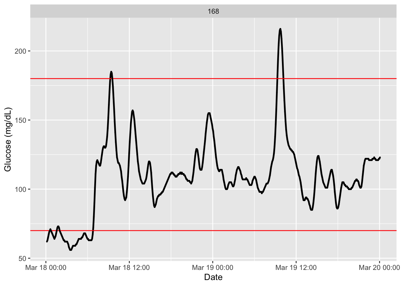
iglu package.Glucose variability (GV) refers to the fluctuations in glucose levels over time. High GV is associated with increased risk of hypoglycemia and long-term complications (Service et al. 1970) (Gude et al. 2017). Many indices have been developed to quantify different aspects of GV.
CGM captures hundreds of readings per day, making it possible to quantify variability with precision. Common GV indices include the standard deviation (SD), mean amplitude of glycemic excursions (MAGE), or time in range (TIR), each capturing a different aspect of glycemic stability.
Why GV matters in clinical practice
Reducing glucose variability is increasingly recognized as a key therapeutic goal. CGM‑derived GV metrics help identify patients at risk, guide medication adjustments, and provide feedback on lifestyle interventions.
We will exemplify indexes obtaining with Colas dataset
library(iglu)
df <- read.csv("Colas/case 168.csv", header = T)[,-1]
names(df) # check the names, very Spanish 🇪🇸(💃🏽)[1] "id" "hora" "glucemia"names(df) =c("id", "time", "gl") # set proper names for iglu
plot_glu(df)
Before we explore complex indices of glucose variability, we start with the foundational metrics that every CGM report includes. These basic summaries (mean glucose, standard deviation, and coefficient of variation) provide a quick snapshot of glycemic control and stability. They are the building blocks for more advanced analyses and are easy to compute with both base R and the iglu package.
We will begin with mean glucose, then move to measures of spread and variability.
The mean glucose is the average of all sensor glucose readings over a given period. It is the most basic summary statistic and provides a quick sense of overall glycemic control. However, mean glucose alone does not tell you about variability or time spent in hypo‑ or hyperglycemia — two patients with the same mean can have very different clinical pictures.
In CGM analysis, mean glucose is typically reported in mg/dL or mmol/L. For a single patient, it gives a snapshot of their average level. For a cohort, it can be used to compare groups (e.g., by diabetes type or treatment).
You can calculate mean glucose using base R functions or with the iglu package, which handles multiple subjects automatically and integrates with other GV metrics.
mean_glu(df)# A tibble: 1 × 2
id mean
<int> <dbl>
1 168 109.While mean glucose tells you the average level, it does not reveal how much glucose swings throughout the day. Two patients with the same mean can have very different risk profiles — one stable, the other with wide fluctuations.
Standard deviation (SD) measures how much glucose values typically deviate from the mean. A higher SD indicates greater variability. In CGM reports, SD is often expressed in the same units as glucose (mg/dL or mmol/L).
Interquartile range (IQR) is the difference between the 75th and 25th percentiles. It describes the spread of the middle 50% of readings, making it less sensitive to extreme values than SD.
Coefficient of variation (CV) is the ratio of SD to the mean, expressed as a percentage: \(CV = (SD / MG) \times 100\). CV normalizes variability by the average glucose level, making it comparable across patients with different mean values. A CV ≤ 36% is often considered stable, while higher values indicate increased risk of hypoglycemia and greater glycemic instability.
Together, these metrics provide a fuller picture of glycemic stability than mean glucose alone.
sd_glu(df) # SD# A tibble: 1 × 2
id SD
<int> <dbl>
1 168 27.2iqr_glu(df) # IQR# A tibble: 1 × 2
id IQR
<int> <dbl>
1 168 23cv_glu(df) # CV# A tibble: 1 × 2
id CV
<int> <dbl>
1 168 25.0The J‑index combines the mean and standard deviation of glucose into a single measure of glycemic variability (Wójcicki 1995). It is calculated as:
\[J = 0.001 \times (\text{MG} + \text{SD})^2\]
Higher J‑index values indicate greater variability. The index is unit‑free and can be used to compare patients regardless of their absolute glucose levels.
j_index(df)# A tibble: 1 × 2
id J_index
<int> <dbl>
1 168 18.5The Glucose Management Indicator (GMI) estimates the HbA1c level that would be expected based on average glucose from CGM data (Bergenstal et al. 2018). It is calculated using the formula:
\[\text{GMI} = 3.31 + 0.02392 \times \text{mean glucose (mg/dL)}\]
For mean glucose in mmol/L, the formula is:
\[\text{GMI} = 3.31 + 0.431 \times \text{mean glucose (mmol/L)}\]
Estimated A1c (eA1c) is an older term that often refers to a similar concept, but GMI is now preferred because it is specifically derived from CGM data and reflects the relationship observed in clinical trials.
Interpreting GMI
GMI is not a substitute for laboratory HbA1c but rather a companion metric. A GMI that differs substantially from measured HbA1c can prompt further investigation into discordance.
gmi(df) # GMI# A tibble: 1 × 2
id GMI
<int> <dbl>
1 168 5.91ea1c(df) # estimated HbA1c (old alternative)# A tibble: 1 × 2
id eA1C
<int> <dbl>
1 168 5.41Basic metrics such as mean glucose and standard deviation provide a useful overview, but they do not fully capture the complexity of glucose dynamics. Advanced metrics go deeper—quantifying the magnitude of glucose excursions, the cumulative burden of hyperglycemia, and the risk of hypoglycemia. In this section, we will explore several of these indices using the iglu package, giving you the tools to characterize glycemic stability in more clinically meaningful ways.
Area under the curve (AUC) in CGM analysis quantifies the total glucose exposure over time (Tai 1994). It sums the area under the glucose trace across the entire monitoring period. This reflects cumulative glucose exposure.
auc(df) # total AUC# A tibble: 1 × 2
id hourly_auc
<int> <dbl>
1 168 109.Graphical representation of AUC for CGM:
library(ggplot2)

# Ensure time is POSIXct
df$time <- as.POSIXct(df$time)

# Plot with shaded area under the curve (AUC)
ggplot(df, aes(x = time, y = gl)) +
  geom_area(fill = "lightblue", alpha = 0.6) +
  geom_line(color = "steelblue", linewidth = 0.8) +
  labs(title = "CGM Trace: Area Under the Curve (AUC)",
       x = "Time", y = "Glucose (mg/dL)") +
  theme_minimal()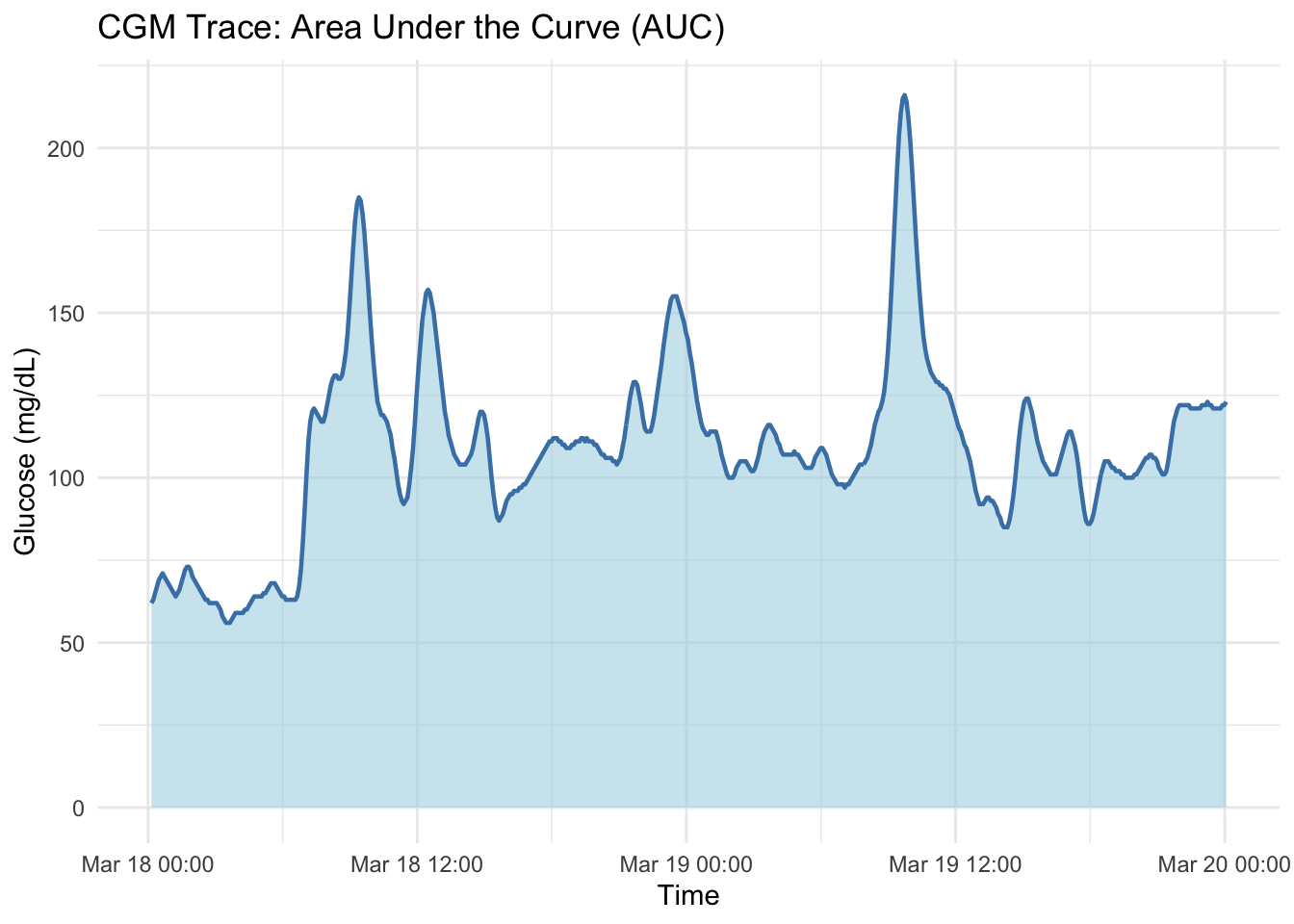
The M‑value reflects the deviation of glucose from a target value (Schlichtkrull, Munck, and Jersild 1965).
m_value(df) # default 90 mg/dL# A tibble: 1 × 2
id M_value
<int> <dbl>
1 168 3.28m_value(df, r = 100) # change to 100 mg/dL# A tibble: 1 × 2
id M_value
<int> <dbl>
1 168 2.46m_value(df, r = 70) # decrease it to 70 mg/dL# A tibble: 1 × 2
id M_value
<int> <dbl>
1 168 11.6The mean amplitude of glycemic excursions (MAGE) quantifies the average magnitude of glucose swings by focusing on the largest upward and downward excursions over a monitoring period. First described by Service et al. (Service et al. 1970), MAGE is calculated by identifying all glucose excursions (both peaks and nadirs) that exceed a threshold — typically one standard deviation of glucose values — and then averaging the amplitudes of those excursions.
MAGE is particularly useful for assessing glycemic instability independent of absolute glucose levels. A high MAGE indicates frequent, large swings, which are associated with increased oxidative stress and risk of hypoglycemia.
Modern implementations, such as the open‑source algorithm by Fernandes et al. (Fernandes et al. 2022), use moving averages to refine excursion detection, making the metric more robust to sensor noise and sampling frequency.
When to use MAGE
Interpreting MAGE
A MAGE value below 60 mg/dL is often considered relatively stable, while values above 120 mg/dL suggest marked glycemic lability. However, thresholds may vary by population and clinical context.
The plot below tracks glucose fluctuations over a period from June 06 to June 19, illustrating the components used to MAGE. Key visual indicators are labeled to help interpret the pattern.
Black data points: Individual glucose readings from the CGM sensor.
Red dots (PEAK): Local maxima, marking the highest point of a glucose spike.
Blue dots (NADIR): Local minima, marking the lowest point before a recovery or after a drop.
Brown arrows (Excursions): Vertical distance (\(\Delta G\)) between a peak and a nadir — these excursions contribute to the MAGE calculation.
Purple shaded vertical bars (Gaps): Periods where the CGM sensor was disconnected or failed to record data.
mage(df, plot = TRUE) # visualize the excursions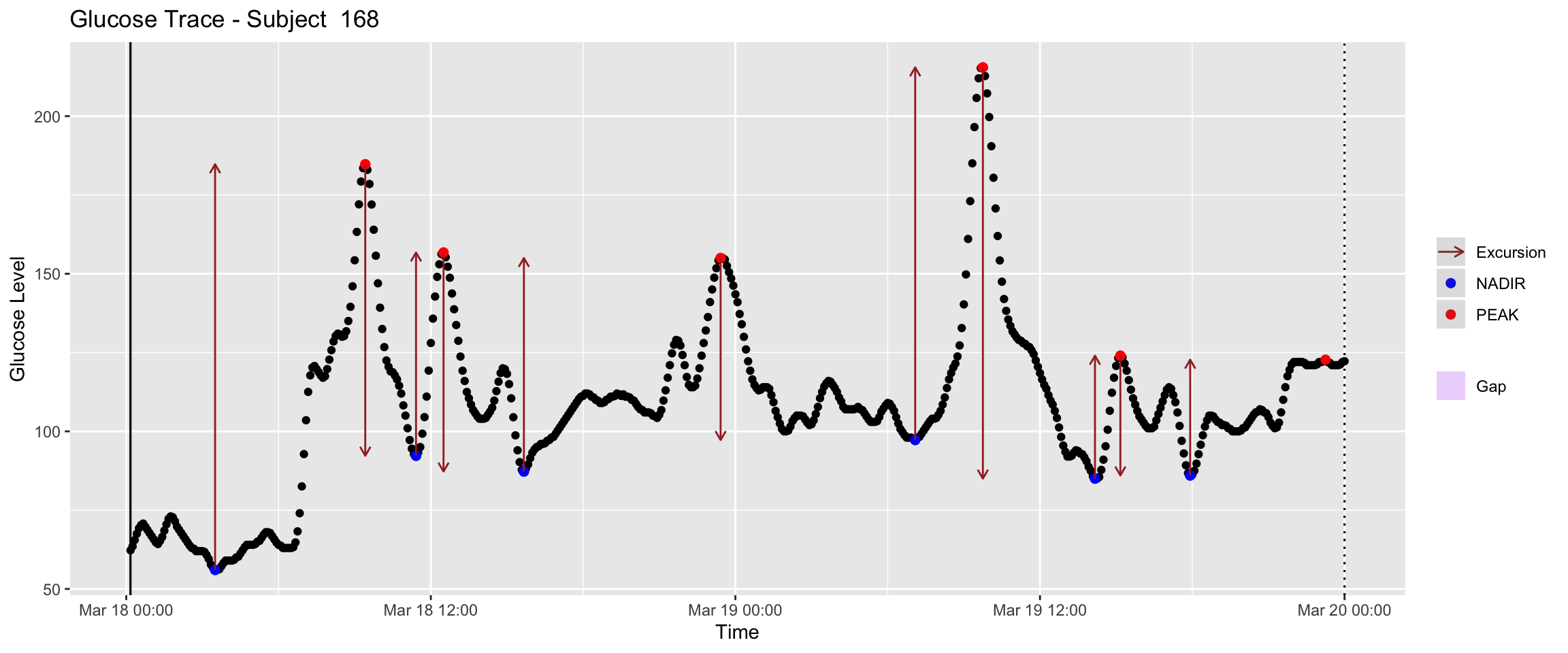
The observed value in this patient is:
mage(df)# A tibble: 1 × 2
# Rowwise:
id MAGE
<int> <dbl>
1 168 76.7The mean absolute glucose (MAG) is a measure of glycemic variability that captures the average absolute difference between consecutive glucose readings (Hermanides et al. 2010). Unlike standard deviation, which measures dispersion around the mean, MAG focuses on the rate of change between successive measurements in n minutes.
MAG is particularly sensitive to rapid fluctuations, making it useful for detecting short‑term instability. High MAG values indicate frequent or large changes between readings.
When to use MAG - To assess short‑term variability that might not be captured by SD or CV. - In situations where glucose is sampled frequently (e.g., every 5‑15 minutes with CGM). - As a complementary metric to MAGE and other excursion‑based indices.
Interpreting MAG
MAG is expressed in the same units as glucose per time interval (e.g., mg/dL per measurement interval). There is no universal threshold, but higher values generally indicate greater instability. Comparing MAG across patients or time periods requires consistent sampling intervals.
mag(df, n=60) # 1 hour apartParameter n must be an integer, input has been rounded to nearest
integer# A tibble: 1 × 2
id MAG
<int> <dbl>
1 168 15.9mag(df, n=180) # 3 hours apartParameter n must be an integer, input has been rounded to nearest
integer# A tibble: 1 × 2
id MAG
<int> <dbl>
1 168 8.16Continuous overlapping net glycemic action (CONGA) is a measure of inter‑days glycemic variability, specifically evaluating the differences between glucose readings at a fixed time interval (McDonnell et al. 2005). It is calculated by taking, for each time point, the difference between the current glucose value and the value one interval (e.g., 12, 24, 48 hours) later, then computing the standard deviation of those differences.
CONGA captures glycemic stability across the day by focusing on periodic patterns. A high CONGA value indicates greater fluctuation at the chosen lag, reflecting inconsistency in glucose levels from one time of day to the next.
conga(df, n = 24) # n = number of hours (default a day)# A tibble: 1 × 2
id CONGA
<int> <dbl>
1 168 29.0conga(df, n = 12) # n = number of hours was decreased to 12# A tibble: 1 × 2
id CONGA
<int> <dbl>
1 168 34.2The mean of daily differences (MODD) measures day‑to‑day glycemic variability by comparing glucose values at the same time on consecutive days (Molnar, Taylor, and Ho 1972). It is calculated by aligning glucose readings from two successive days and taking the average absolute difference between paired time points.
MODD captures consistency across days, making it useful for evaluating the stability of daily patterns (e.g., whether a patient’s glucose profile looks similar from one day to the next). A high MODD indicates poor reproducibility, while a low MODD suggests stable daily rhythms.
The calculation requires at least two full days of CGM data.
modd(df, lag = 1) # lag is the number of days# A tibble: 1 × 2
id MODD
<int> <dbl>
1 168 25.4modd(df, lag = 2) # lag increased to 2 days# A tibble: 1 × 2
id MODD
<int> <dbl>
1 168 NaNThe glycemic risk assessment diabetes equation (GRADE) is a composite measure that evaluates overall glycemic risk by weighting the severity of hypo‑ and hyperglycemia (Hill et al. 2007). It assigns a higher penalty to more extreme glucose values, making it sensitive to both frequency and magnitude of excursions.
GRADE is calculated by transforming each glucose reading into a risk score using a quadratic function, then summing these scores over the monitoring period. The result is a single number that reflects total glycemic risk, often decomposed into components attributable to hypoglycemia, euglycemia, and hyperglycemia.
grade(df)# A tibble: 1 × 2
id GRADE
<int> <dbl>
1 168 2.56The low blood glucose index (LBGI) and high blood glucose index (HBGI) are risk‑based measures that quantify the frequency and severity of hypoglycemia and hyperglycemia, respectively (Kovatchev et al. 1997).
LBGI reflects the risk of hypoglycemia, with higher values indicating greater hypoglycemic burden.
HBGI reflects the risk of hyperglycemia, with higher values indicating greater hyperglycemic burden.
Both indices are expressed on a scale where values above 5 indicate clinically significant risk, though thresholds may vary by population. LBGI and HBGI are particularly useful in clinical trials and risk stratification because they weight extreme values more heavily than simple percentages.
Interpreting LBGI and HBGI
Both indices are unit‑free. Typically, LBGI ≤ 2.5 is considered low risk, 2.5–5 moderate risk, and > 5 high risk for hypoglycemia. Similar thresholds apply to HBGI for hyperglycemia. The iglu package returns these values directly.
lbgi(df)# A tibble: 1 × 2
id LBGI
<int> <dbl>
1 168 1.77hbgi(df)# A tibble: 1 × 2
id HBGI
<int> <dbl>
1 168 0.624The average daily risk range (ADRR) is a metric that summarizes daily glycemic risk by combining the maximum and minimum risk scores for each day (Kovatchev et al. 2006). It is derived from the same symmetrization transformation used for LBGI and HBGI, and provides a single measure of overall risk across multiple days.
Interpreting ADRR
ADRR values typically range from 0 to > 40. Lower values indicate better daily stability, while higher values reflect greater daily risk. The iglu package provides ADRR directly, requiring at least two full days of data.
adrr(df)# A tibble: 1 × 2
id ADRR
<int> <dbl>
1 168 14.4The time in range (TIR) metrics quantify the percentage of CGM readings that fall within specified glucose target ranges. These metrics are central to modern CGM interpretation and are recommended by international consensus (Battelino et al. 2019, 2023). The iglu package provides the function in_range_percent() to calculate TIR for one or more target ranges.
| Argument | Description |
|---|---|
data |
Data frame with columns "id", "time", "gl", or a numeric vector of glucose values. |
target_ranges |
List of paired numeric vectors defining the target intervals. Default is list(c(70, 180), c(63, 140)). The first range (70–180 mg/dL) is recommended for type 1 and type 2 diabetes; the second (63–140 mg/dL) is used for pregnancy. |
in_range_percent(df, target_ranges = list(c(70, 140), c(70, 180), c(55, 250)))# A tibble: 1 × 4
id in_range_55_250 in_range_70_140 in_range_70_180
<int> <dbl> <dbl> <dbl>
1 168 100 78.1 85.2Clinical note
For healthy individuals without diabetes, the percentage of time with glucose above 130 mg/dL is associated with a higher risk of developing diabetes (Pazos-Couselo et al. 2025). This suggests that CGM‑derived metrics can help identify at‑risk populations even before clinical diagnosis—and that time‑in‑range thresholds may need to be adapted for screening purposes.
We will now calculate these indices to the Colas dataset. First, load all files and combine them into a single data frame.
df_all <- read.csv("Colas_clinical/colas_long.csv", header = T)
names(df_all) =c("id", "time", "gl")
We can obtain for instance, the CONGA these records.
conga(df_all)# A tibble: 208 × 2
id CONGA
<int> <dbl>
1 1 16.1
2 2 24.3
3 3 15.8
4 4 20.5
5 5 20.8
6 6 15.7
7 7 17.0
8 8 17.1
9 9 18.9
10 10 12.6
# ℹ 198 more rowsSimilarly for any other metric:
MG <- mean_glu(df_all)
SD    <- sd_glu(df_all)
ji    <- j_index(df_all)
mage <- mage(df_all)
# ... similarly for other indices
Now we have a collection of values that need to be described.
MG# A tibble: 208 × 2
id mean
<int> <dbl>
1 1 98.6
2 2 107.
3 3 90.1
4 4 95.1
5 5 98.8
6 6 114.
7 7 103.
8 8 94.0
9 9 101.
10 10 85.1
# ℹ 198 more rowsmage# A tibble: 208 × 2
# Rowwise:
id MAGE
<int> <dbl>
1 1 56.8
2 2 50.9
3 3 34.5
4 4 55.3
5 5 50.4
6 6 47.9
7 7 49.1
8 8 66.8
9 9 35.2
10 10 36.5
# ℹ 198 more rowshist(mage$MAGE)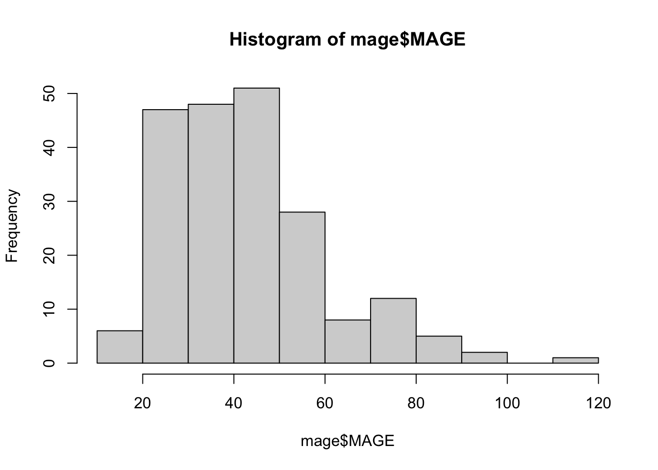
We have seen how to compute a wide array of glucose variability metrics using iglu. These indices will serve as the basis for later descriptive and inferential analyses.