install.packages("iglu")4 Description of continuous glucose monitoring profiles
4.1 Learning Objectives
- Visualize CGM profiles using time series, lasagna plots, and ambulatory glucose profiles (AGP).
- Identify hypoglycemic and hyperglycemic episodes.
4.2 The iglu R Package
The iglu package implements a wide range of glucose variability (GV) metrics and visualizations specifically designed for CGM data (Broll et al. 2021). It is built on the tidyverse philosophy, making it easy to integrate with your existing data cleaning and analysis workflows.
Key features of iglu
- GV metrics: calculate standard deviation (SD), coefficient of variation (CV), mean amplitude of glycemic excursions (MAGE), mean of daily differences (MODD), and many others — all from a simple data frame.
- Time in range (TIR): compute percent time spent above, below, or within target ranges, with options for standard (70–180 mg/dL) or custom targets.
- Visualizations: create AGP‑style plots, glucose traces, and variability charts with minimal code.
- Workflow integration: functions accept data frames with columns for time, glucose, and (optionally) subject ID, so you can run analyses on one patient or a whole cohort.
Why we use it in this course
Instead of writing complex formulas from scratch, you will use iglu to quickly generate clinically meaningful metrics. This allows you to focus on interpretation rather than implementation.
Getting started
Install the package with install.packages("iglu") and load it with library(iglu). The package documentation (?iglu) provides detailed examples for every function.
We will use iglu throughout the rest of this session to compute GV metrics, generate Ambulatory Glucose Profile plots (next session), and produce nursing and patient friendly reports.
library(iglu)4.3 Visualizing CGM Data Raw Records
The iglu package provides several plotting functions to explore CGM data. A good starting point is a time series plot showing glucose readings over time.
For a single subject, you can use plot_glu() which generates a line plot with optional horizontal lines delimiting target ranges. The function expects a data frame with columns for time and glucose (and optionally an id column).
Note: The names of time and glucose reading columns should be set to
"time","gl". While, when considering multiple patients you may set the name"id"as patient identifier.
Customizing plots
plot_glu() accepts additional arguments such as target_range (e.g., c(70, 180)) to highlight the target zone, and units to display glucose in mg/dL or mmol/L. You can also use ggplot2 functions to further customize the appearance (see (Posit 2025) and (Wickham 2016)).
Here I read CGM data for participant id = 168 and plot (in this case his) registered glucose values in mg/dL over the recording time period.
df <- read.csv("Colas/case  168.csv", header = T)[,-1]
names(df) # check the names, very Spanish 🇪🇸(💃🏽)
[1] "id" "hora" "glucemia"names(df) =c("id", "time", "gl") # set proper names for iglu
range(df$time) # March the 18 to March the 20 (year 2015)[1] "2015-03-18 00:08:44" "2015-03-20 00:03:44"# Observed CGM data
plot_glu(df, plottype = "ts")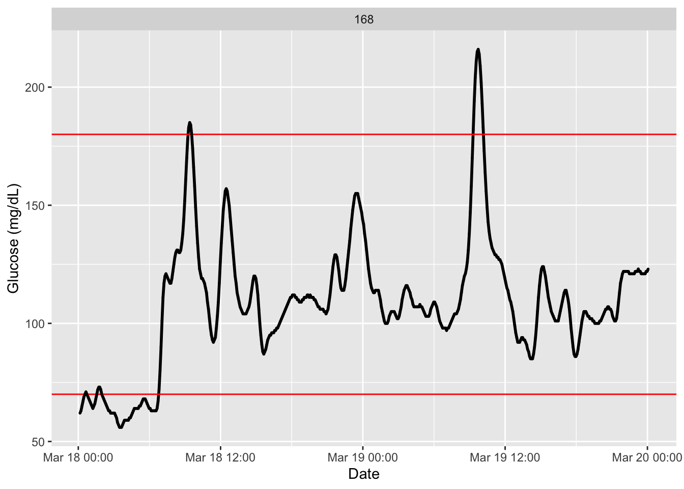
We see there the recording glucose values in mg/dL along a couple of days with horizontal red lines indicating the usual time in range(Battelino et al. 2023), between 70 mg/dL to 180 mg/dL. We also observe no discontinuity on the registered data.
With the following code we can set other reference values to be plotted for reference. See function arguments (LLTR for low thresholds) and (ULTR for higher ones). We will plot additionally the tight-range (see for instance, (Kim et al. 2025)).
plot_glu(df, plottype = "ts", LLTR = c(55, 70), ULTR = c(140, 180))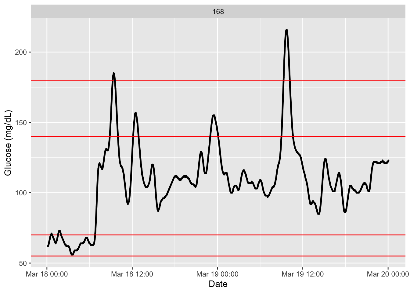
We can easily plot data from several participants or patients at once. Giving all patients records stacked at colas_long.csv, we do:
df_all <- read.csv("Colas_clinical/colas_long.csv", header = T)
names(df_all) =c("id", "time", "gl")
dim(df_all) # a lot of records (over 100 thousand glucose values)
[1] 114875 3head(df_all) id time gl
1 1 2015-09-26 00:00:28 86
2 1 2015-09-26 00:05:28 81
3 1 2015-09-26 00:10:28 78
4 1 2015-09-26 00:15:28 76
5 1 2015-09-26 00:20:28 76
6 1 2015-09-26 00:25:28 77tail(df_all) id time gl
114870 208 2015-09-25 23:37:41 105
114871 208 2015-09-25 23:42:41 103
114872 208 2015-09-25 23:47:41 101
114873 208 2015-09-25 23:52:41 100
114874 208 2015-09-25 23:57:41 98
114875 208 2015-09-26 00:02:41 96# in subjects we set partipants' id
plot_glu(df_all, subjects = c(52,79,92,108,150,156))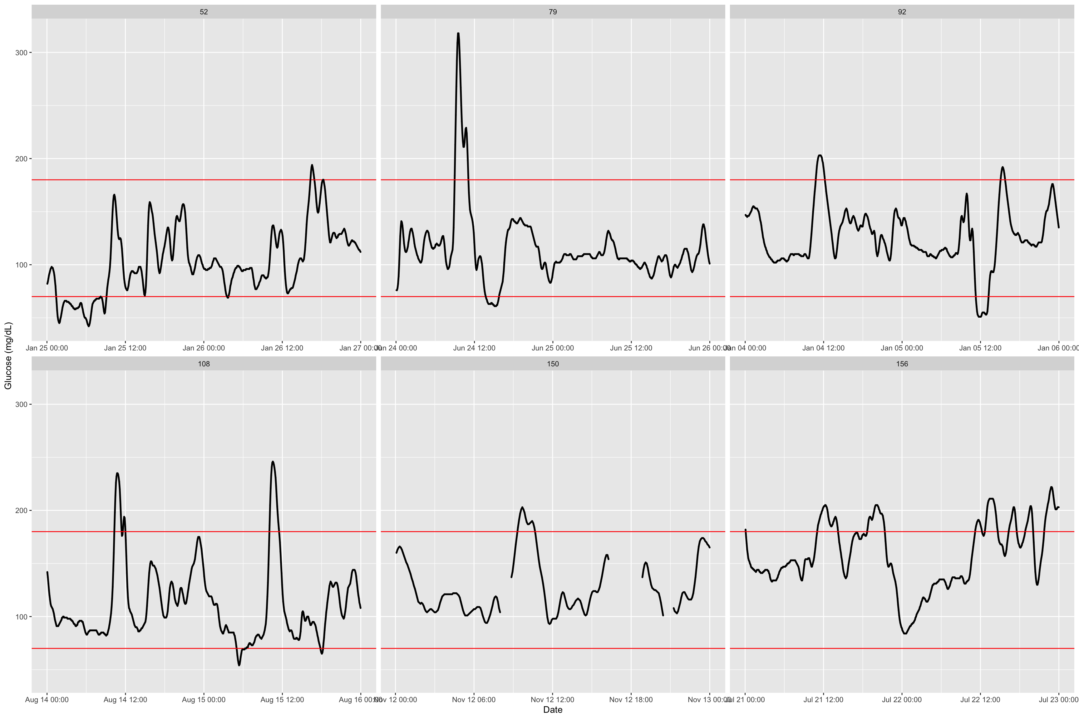
The function has additional argument, an interesting one is inter_gap where we set the admissible time gap for which interpolation of non-recorded values is reasonable. See this example with a decreasing to only 5 minutes and how we observe a gap that was not there before.
df2 <- read.csv("Colas/case  150.csv", header = T)[,-1]
names(df2) =c("id", "time", "gl")

plot_glu(df2,inter_gap = 45) # default setting is 45 minuntes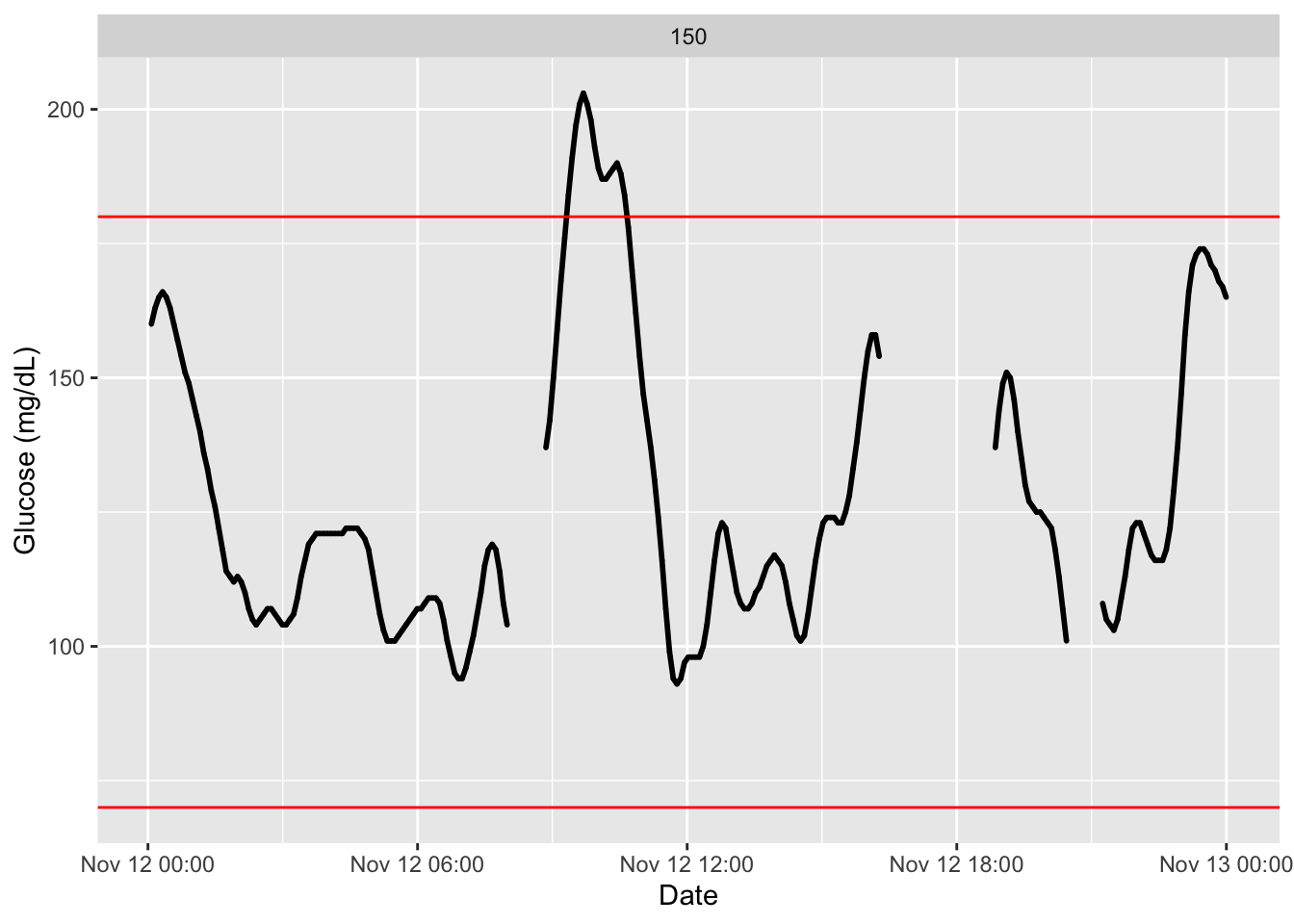
p = plot_glu(df2,inter_gap = 5)
library(ggplot2)
p + annotate("point", x = as.POSIXct("2015-11-12 05:00:00"), y = 120, shape = 1, size = 12, color = "red", stroke = 2)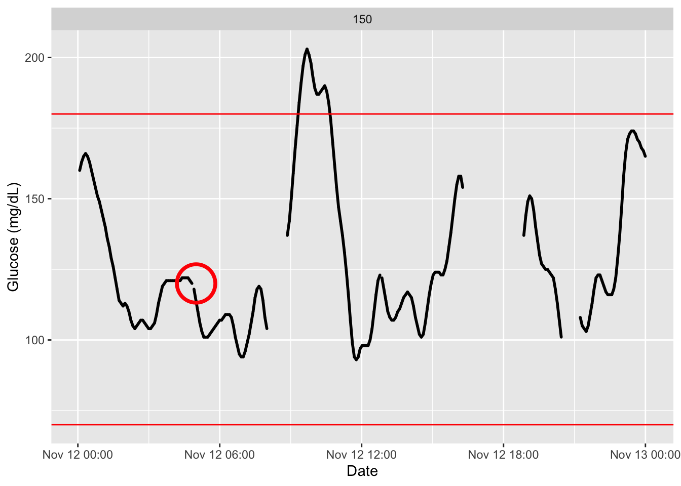
These plots can also be made interactive with the argument
static_or_gui.
plot_glu(df2, static_or_gui = "plotly")4.4 Lasagna Plot
A lasagna plot (also called a heatmap) displays glucose values over multiple days, with each day represented as a row (Swihart et al. 2010). The color intensity reflects glucose levels, making it easy to identify daily patterns, time‑of‑day trends, and intermittent excursions. Lasagna plots are particularly useful for visualizing glycemic variability across days and spotting recurring issues (e.g., postprandial spikes or nocturnal hypoglycemia).
In the iglu package, the lasagna_plot() function creates this visualization directly from your CGM data.
Interpreting lasagna plots
Rows correspond to consecutive days, columns to time points (e.g., 5‑minute intervals). Darker colors typically indicate higher glucose (e.g., red for hyperglycemia) and lighter colors lower glucose (e.g., blue for hypoglycemia). White gaps often represent missing data (periods of sensor disconnection).
df <- read.csv("Colas/case  168.csv", header = T)[,-1]
names(df) =c("id", "time", "gl")
df$id <-  as.factor(df$id)

p = plot_glu(df, plottype = "lasagna")
p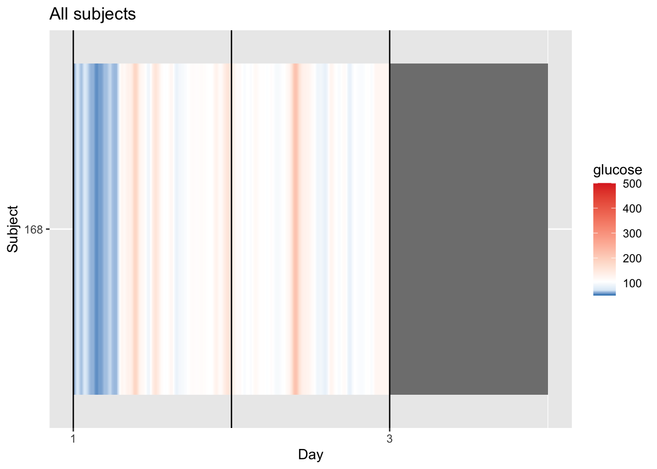
p = p + coord_cartesian(xlim=c(1,3)) # set x limits to observed range (kind of)

midpoint_val <- median(df$gl, na.rm = TRUE)

p + scale_fill_gradient2(
  low = "blue", mid = "white", high = "red",
  midpoint = midpoint_val,
  limits = c(min(df$gl, na.rm = TRUE), max(df$gl, na.rm = TRUE))
)
4.4.1 Understanding the Single‑Patient Lasagna Plot
For a single patient, the lasagna plot (or heatmap displays glucose levels across multiple days, with each day as a column. This helps you spot daily patterns, such as consistent post‑meal spikes or overnight trends.
How to Read the Plot (or try to): - Columns \(\rightarrow\) Time of day (e.g., 00:00 to 23:55 in 5‑min intervals).
- Colors \(\rightarrow\) Glucose values (darker red = higher glucose, blue = lower glucose).
| Color | Meaning | Clinical Context |
|---|---|---|
| Blue bands | Low or stable glucose | Typically seen overnight or during fasting. |
| Red/orange bands | Hyperglycemic episodes | Often represents post‑meal spikes. |
| White areas | Baseline range | Glucose is close to median glucose values. |
| Grey gaps | Missing data | Indicates sensor disconnection or warm‑up. |
Why “Day‑Sorted” Matters
By stacking days vertically, you can quickly see whether patterns repeat consistently (vertical stripes) or vary from day to day.
Example: If every day shows a red stripe at 2:00 PM, that suggests a consistent daily post‑lunch spike. If the red stripes shift or disappear, it may reflect irregular meal times, varying physical activity, or treatment adjustments.
4.4.2 Multiple Patients Lasagna Plot
This visualization can also, and should, be used to visualize records of multiple patients.
df_all <- read.csv("Colas_clinical/colas_long.csv", header = T)
names(df_all) =c("id", "time", "gl")
df_all$id = as.factor(df_all$id) # convert id to factor, I dont want a numeric on that.

# I select only first 10 subjects
plot_glu(df_all, plottype = "lasagna", datatype = "all",subjects = 1:10) 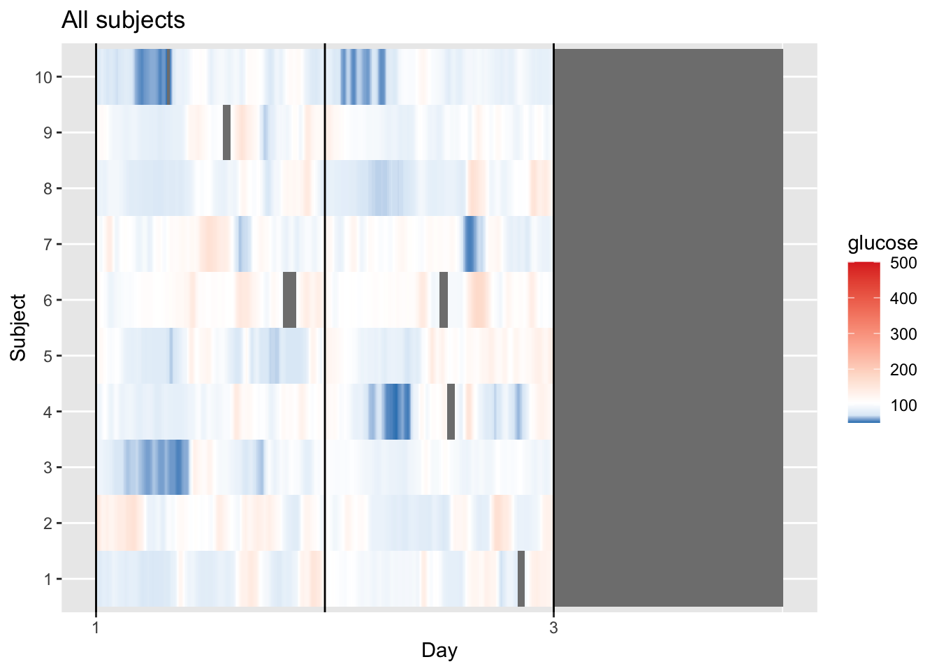
Fix the graph a little bit:
p = plot_glu(df_all, plottype = "lasagna", datatype = "all",subjects = 1:10)
p = p + coord_cartesian(xlim=c(1,3))

midpoint_val <- median(df$gl, na.rm = TRUE)

p + scale_fill_gradient2(
  low = "blue", mid = "white", high = "red",
  midpoint = midpoint_val,
  limits = c(min(df$gl, na.rm = TRUE), max(df$gl, na.rm = TRUE))
)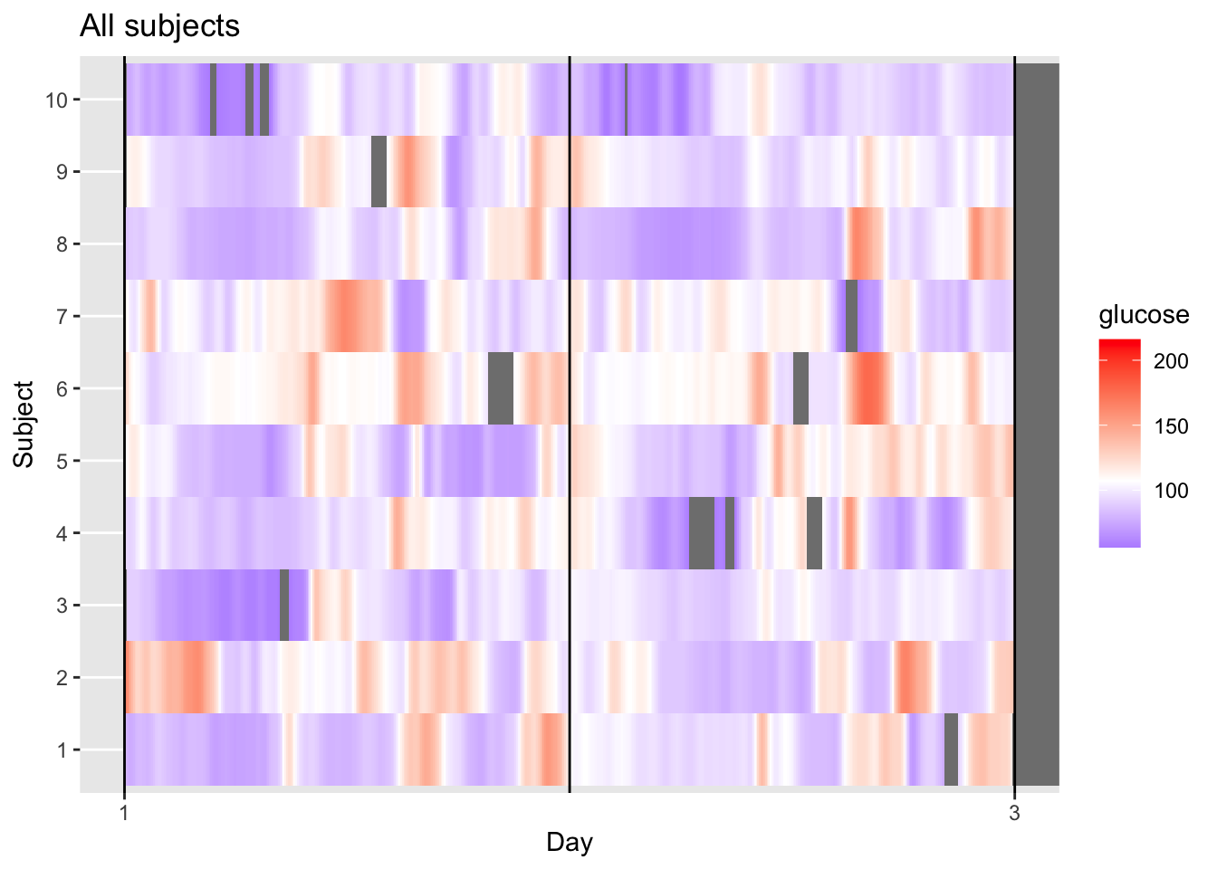
This visualization provides a longitudinal view of glucose levels for multiple subjects simultaneously. By keeping each subject in each row, we can observe individual responses to time and daily events. Each horizontal row (1–10) represents one unique subject, while the X-axis tracks a continuous timeline from Day 1 to the start of Day 3. The color scale indicates glucose concentration in mg/dL, where purple/blue represents lower levels (near 100 mg/dL), white represents the group median (defined as midpoint_val in the code), and red/orange indicates elevated levels (approaching 200 mg/dL).
Looking at the data, we can see clear individual variability, for instance, Subject 10 maintains very stable, lower glucose levels (mostly purple), whereas Subject 2 and Subject 6 exhibit high variability with frequent orange/red “hot spots.”
The grey areas represent missing data, appearing either as thin vertical slices where an individual’s sensor dropped out (like in Subject 4 or 6) or as a large block on the right where the recording ended for the entire group.
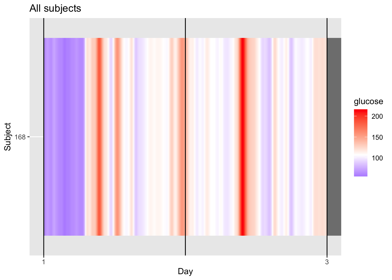
4.4.3 Average Lasagna Plot (Daily Modal Profile)
When you set datatype = "average", the lasagna plot transforms from a chronological timeline into a diurnal modal profile. Instead of showing every day in sequence, the algorithm collapses the entire monitoring period (e.g., 5 or 14 days) into a single representative 24‑hour period. Each row still represents an individual subject, but the X‑axis now represents the Time of Day from 00:00 to 23:59.
The color in each cell represents the mean glucose value for that specific subject at that specific time across their entire recording duration. This approach is highly effective for identifying “clock‑locked” patterns, such as a subject who consistently spikes at 8:00 AM after breakfast or someone who routinely dips into hypoglycemia at 3:00 AM. By averaging the data, the plot smooths out one‑off anomalies—like a single high‑carb meal—to highlight a subject’s typical metabolic behavior.
Visually, this often eliminates many of the “patchy” grey gaps seen in longitudinal plots because most time slots are eventually filled over multiple days of sensor wear. If a vertical red band appears in this “average” mode, it indicates a high‑confidence trend of hyperglycemia at that specific hour for that patient.
Interpreting the average lasagna plot
Rows are subjects, columns are hours of the day. Dark red vertical bands show times when many subjects tend to have high glucose (e.g., post‑prandial peaks). Blue bands reveal times of stable or low glucose (e.g., overnight). White cells indicate glucose near the target range.
plot_glu(df_all, plottype = "lasagna", datatype = "average",subjects = 1:10) 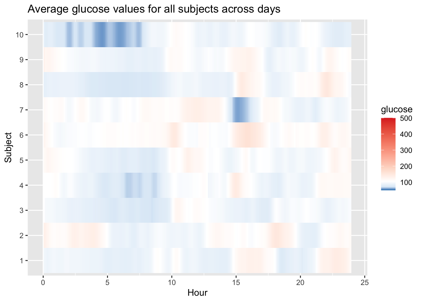
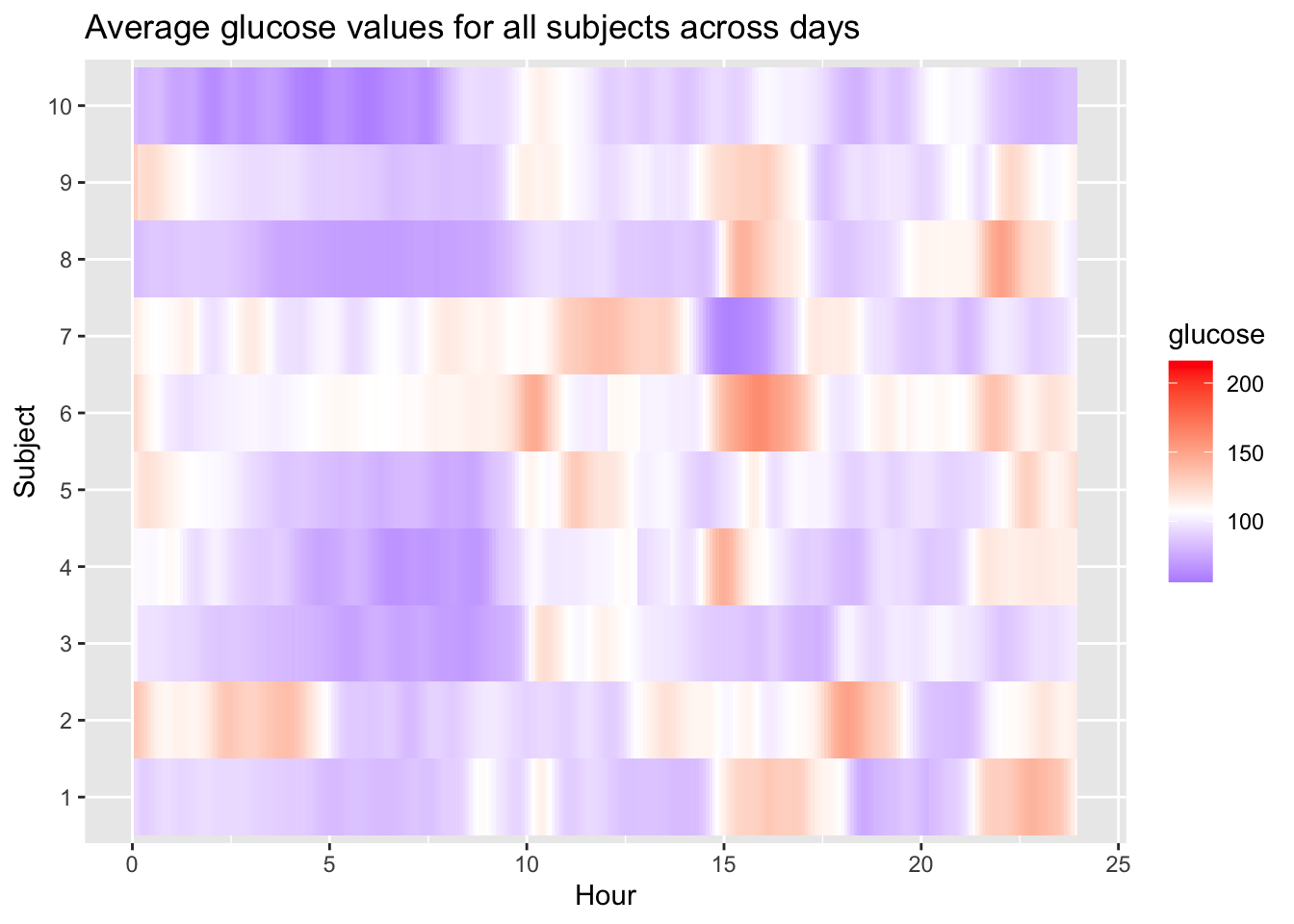
Fix colour scale in our graph:
p = plot_glu(df_all, plottype = "lasagna", datatype = "average",subjects = 1:10)

midpoint_val <- median(df$gl, na.rm = TRUE)

p + scale_fill_gradient2(
  low = "blue", mid = "white", high = "red",
  midpoint = midpoint_val,
  limits = c(min(df$gl, na.rm = TRUE), max(df$gl, na.rm = TRUE))
)
Interactive plots may also be obtained:
plot_glu(df_all, plottype = "lasagna", datatype = "average",subjects = 1:10, static_or_gui = "plotly") 4.5 Ambulatory Glucose Profile (AGP)
The ambulatory glucose profile (AGP) is a standardized graphical report that summarizes CGM data by overlaying multiple days of glucose readings onto a single 24‑hour grid (Johnson et al. 2019). It displays the median, interquartile range (IQR), and often the 5th and 95th percentiles, providing a clear visual of glycemic patterns, variability, and risk of hypo‑ and hyperglycemia.
In the iglu package, the agp() function creates this plot directly from your data. It automatically calculates the necessary percentiles and overlays them on a time‑of‑day axis.
Interpreting the AGP
- Dark blue line: median glucose (50th percentile)
- Dark blue shaded band: interquartile range (25th–75th percentiles)
- Light blue shaded band: 5th–95th percentile range
- Target range shading: often shown as a horizontal band (e.g., 70–180 mg/dL)
- Time axis: runs from midnight to midnight, allowing identification of daily patterns (e.g., post‑meal peaks, nocturnal lows)
df = df[-nrow(df),] # removing this single record for sake of visualization
agp(df, daily = FALSE)   # without daily lines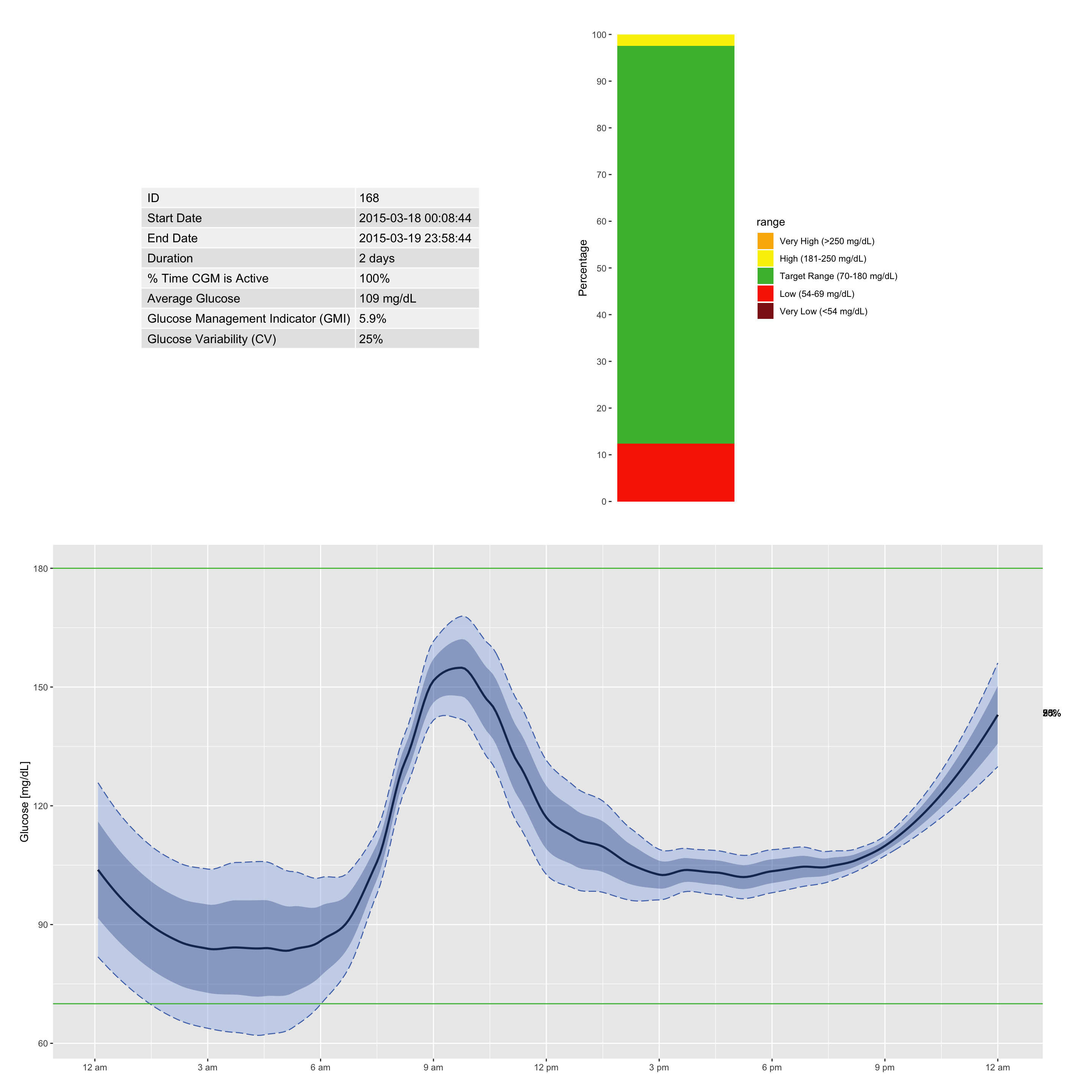
You can easily add individual day profiles to the AGP to see where the mean and percentiles originate. Overlaying the raw daily traces helps identify which days contributed to specific peaks or dips, and pinpoints hypoglycemic or hyperglycemic episodes. This combination of summary and raw data gives a complete picture of a patient’s glycemic stability.
plot_daily(df) # separate daily profiles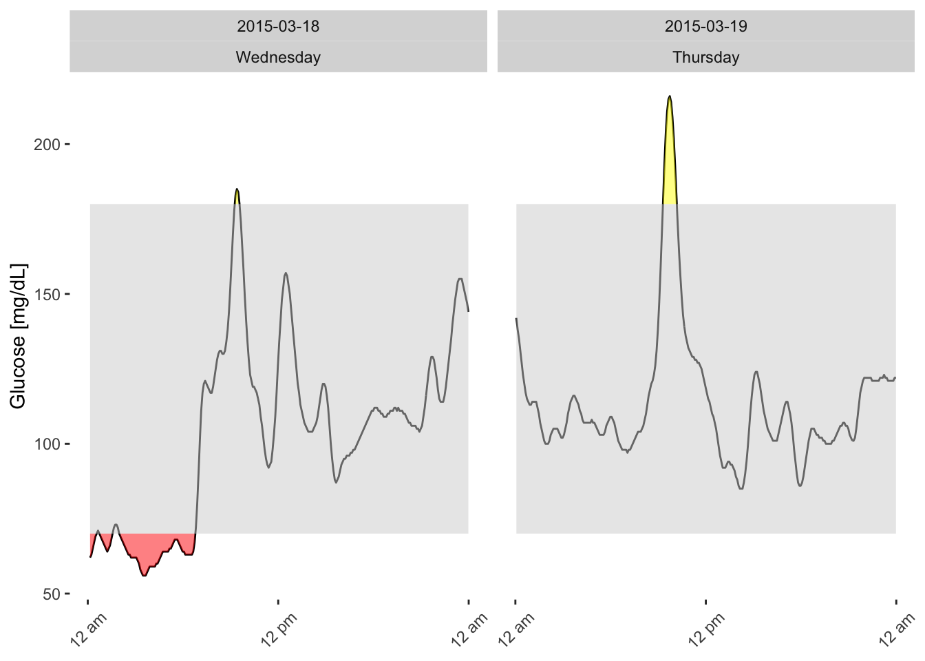
The agp_metrics() function from the iglu package returns a summary of key CGM metrics for a single patient (or a cohort). Below is an example output for patient 168 over a 2‑day period:
agp_metrics(df) %>% as.data.frame() id start_date end_date ndays active_percent mean
1 168 2015-03-18 00:08:44 2015-03-19 23:58:44 2 days 100 108.6748
GMI CV below_54 below_70 in_range_70_180 above_180 above_250
1 5.909501 25.03482 0 12.34783 85.21739 2.434783 0What do these numbers tell us?
- mean (108.7 mg/dL) – Average glucose is well within the target range.
- GMI (5.9%) – Estimated HbA1c equivalent, corresponding to good glycemic control.
- CV (25.0%) – Coefficient of variation; below the 36% threshold, indicating stable glucose levels.
- below_54 (0%) – No time spent in dangerously low glucose (<54 mg/dL).
- below_70 (12.3%) – Moderate time in hypoglycemia (<70 mg/dL). This may warrant attention, especially if nocturnal or recurrent.
- in_range_70_180 (85.2%) – Excellent time in range, exceeding the typical target of 70%.
- above_180 (2.4%) – Minimal hyperglycemia.
- above_250 (0%) – No extreme hyperglycemic events.
Clinical takeaway:
Patient 168 has excellent overall control with high time in range and low variability, but shows some hypoglycemia (12% below 70 mg/dL).
4.6 Hypo or Hyperglycemia Episodes Calculation
The episode_calculation() function (available in the iglu package) identifies hypoglycemic and hyperglycemic episodes based on consensus definitions (Battelino et al. 2023). An episode is defined as a continuous period where glucose values remain below (or above) a specified threshold for at least a given duration (e.g., ≥15 minutes for hypoglycemia). This function returns the number, duration, and area of episodes, enabling detailed assessment of glycemic events.
Common thresholds
- Hypoglycemia: typically <70 mg/dL (or <54 mg/dL for clinically significant hypoglycemia)
- Hyperglycemia: typically >180 mg/dL (or >250 mg/dL for severe hyperglycemia)
Columns
| Column | Description |
|---|---|
id |
Patient identifier |
type |
Type of episode: hypo (hypoglycemia) or hyper (hyperglycemia) |
level |
Severity or classification level (see below) |
avg_ep_per_day |
Average number of episodes per day |
avg_ep_duration |
Average duration of episodes (minutes) |
avg_ep_gl |
Average glucose level during episodes (mg/dL) |
total_episodes |
Total number of episodes recorded |
Row (Level) Definitions
| Level | Description |
|---|---|
lv1 |
Level 1 hypoglycemia: glucose <70 mg/dL (or hyperglycemia: >180 mg/dL) |
lv2 |
Level 2 hypoglycemia: glucose <54 mg/dL (or hyperglycemia: >250 mg/dL) — clinically significant |
extended |
Hypoglycemia episodes that last longer than a defined extended duration (e.g., >120 minutes) |
lv1_excl |
Level 1 episodes excluding those that are part of extended episodes (helps avoid double‑counting) |
Why episode analysis matters
Episode analysis reveals how many hypoglycemic or hyperglycemic events occur and how severe they are. A patient may have 10% time below 70 mg/dL due to many short dips versus one prolonged overnight low — the clinical implications differ greatly.
episode_calculation(df)# A tibble: 7 × 7
id type level avg_ep_per_day avg_ep_duration avg_ep_gl total_episodes
<fct> <chr> <chr> <dbl> <dbl> <dbl> <dbl>
1 168 hypo lv1 1.00 188. 64.9 2
2 168 hypo lv2 0 0 NA 0
3 168 hypo extended 0.502 290 62.9 1
4 168 hyper lv1 1.00 35 193. 2
5 168 hyper lv2 0 0 NA 0
6 168 hypo lv1_excl 1.00 188. 64.9 2
7 168 hyper lv1_excl 1.00 35 193. 2For patient 168:
- Hypoglycemia – Level 1:
- 2 episodes total, averaging 1 per day.
- Average duration ≈188 minutes (over 3 hours) – these are prolonged events.
- Average glucose during episodes ≈64.9 mg/dL.
- 2 episodes total, averaging 1 per day.
- Hypoglycemia – Level 2:
- 0 episodes (no glucose <54 mg/dL).
- Hypoglycemia – Extended:
- 1 episode lasting ≥ extended duration (here 290 minutes).
- This episode is likely one of the two Level 1 episodes (the longer one).
- 1 episode lasting ≥ extended duration (here 290 minutes).
- Hyperglycemia – Level 1:
- 2 episodes, averaging 1 per day, each about 35 minutes long, with average glucose ≈193 mg/dL.
- Hyperglycemia – Level 2:
- 0 episodes (no glucose >250 mg/dL).
lv1_exclrows:- These show Level 1 episodes that are not part of extended episodes. Here both hypo and hyper
lv1_exclmatch thelv1counts, meaning none of the Level 1 episodes were excluded (they were not part of extended events).
- These show Level 1 episodes that are not part of extended episodes. Here both hypo and hyper
Clinical takeaway
Patient 168 has two prolonged hypoglycemic episodes (Level 1) averaging 188 minutes each, and two short hyperglycemic spikes (Level 1) averaging 35 minutes. The prolonged hypoglycemia is a concern; the next step would be to examine when these episodes occur (e.g., overnight or post‑exercise) and consider adjusting therapy to reduce their duration.
Detailed episode data: If you need the start and end times of each individual episode, use
return_data = TRUE. The function will return a list containing both the summary table and a detailed data frame with timestamps and episode identifiers.
epi <- episode_calculation(df, return_data = TRUE)
head(epi$data)
# A tibble: 6 × 11
id time gl segment lv1_hypo lv2_hypo lv1_hyper lv2_hyper
<fct> <dttm> <dbl> <int> <dbl> <dbl> <dbl> <dbl>
1 168 2015-03-18 01:10:00 62.3 2 1 0 0 0
2 168 2015-03-18 01:15:00 63.5 2 1 0 0 0
3 168 2015-03-18 01:20:00 65.5 2 1 0 0 0
4 168 2015-03-18 01:25:00 67.5 2 1 0 0 0
5 168 2015-03-18 01:30:00 69.3 2 1 0 0 0
6 168 2015-03-18 01:35:00 70.3 2 1 0 0 0
# ℹ 3 more variables: ext_hypo <dbl>, lv1_hypo_excl <dbl>, lv1_hyper_excl <dbl>4.6.1 Visualize Episodes
The epicalc_profile() function (from the iglu package) creates a visual representation of hypo‑ and hyperglycemic episodes over time. This plot helps you quickly grasp the frequency, timing, and severity of events.
epicalc_profile(df)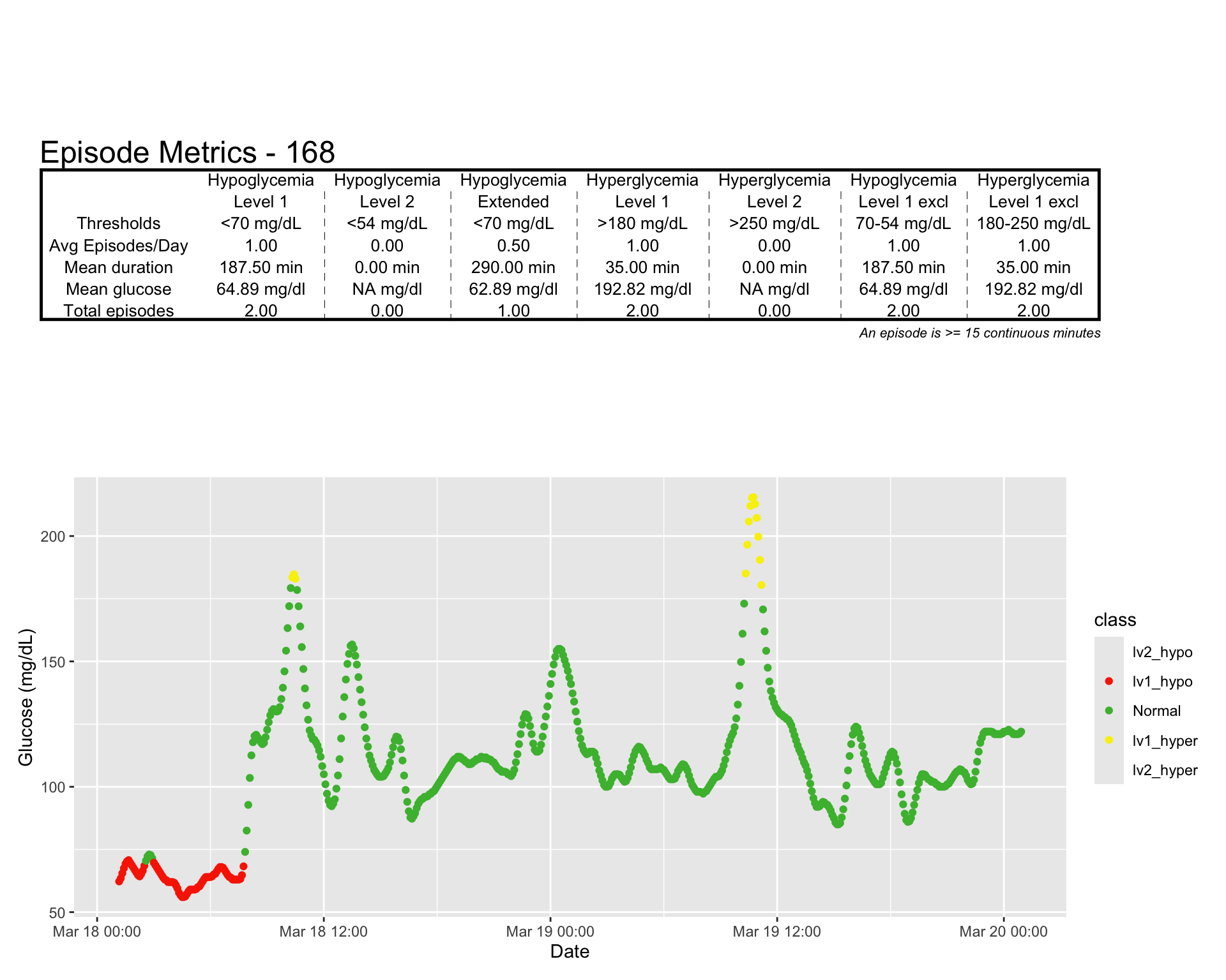
4.7 Summary
We have explored various graphical tools to describe CGM profiles and summarized variability indices using descriptive statistics. In the next chapter, we will use regular descriptive statistics over the most commonly used indexes.